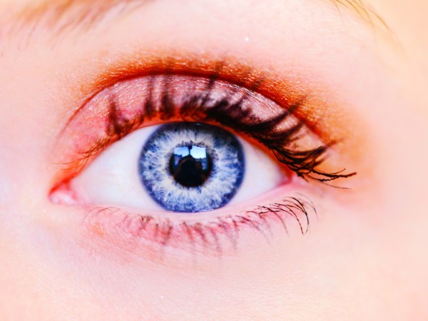
The colours we see depend upon the reflection of the visible wavelengths of light to our eyes.
The most important thing to remember/know/think about when considering colour is that it is the product of reflected light. Colour is, therefore, the absence of other (unreflected) light. This is counter-intuitive, but true.
The Franklin Institute has a good explanation of how we see colour.
Monkey Butt Red.
Q. I’d like my image to be a fetching shade of sea mist green to match the new paintwork in my lounge, can you do that?
Yes, but it depends on how precise you want/need the colour match to be.
In theory, nowadays, images can be printed in any colour. However, in practice, this seemingly straight-forward request can be quite difficult to achieve, if absolute precision is required. Here’s why.
There is no standard naming convention for colours.
So, objectively, “sea mist green”, is a meaningless term. A paint company may call their paint sea mist green and a computer company may call a colour rendered by their operating system sea mist green… yet the two colours can be completely different.
You have to establish, what your reference colour is… and the only way to do this is reproduce the colour (you are trying to match) as it exists in the real world.
You can’t rely on colour charts. (We’ve all been down the DIY store bought a colour that looked nice on a chart, slapped it on the wall and hated it… this is, often, caused by the ambient lighting conditions in the room differing from the ambient lighting conditions when viewing the colour chart; and the fact that the new paint, itself, alters the ambient lighting conditions in the room.)
Nor can you rely on colour values for the reference colour. This is because, in the real world, the colour is a reflection, and its characteristics are, in part, determined by the (reflections from) other colours around it.
You have to establish, how your reference colour should be applied to your image.
This is where it gets tricky, especially, if your starting image is a colour image. You cannot simply put the reference colour on top of your image, because the colours in the original image and the reference colour interact. E.g. if you put a reference yellow on top of a beach scene with a blue sky and red umbrella; you’ll get a green sky and an orange umbrella, which isn’t what you want.
Most labs deal with these problems by simply abandoning all the colour information in the original image, i.e. they convert your colour image to grey-scale and then overlaying your reference colour.
This works, but it is a bit pants… because the colour information in the original image is lost… and without getting too involved in the technicalities, this colour information is important to the way the image will be perceived, even when all those colours are changed. The resulting image is a bit flat and insipid.
We have a much better way of doing it than that, one that preserves important colour information and takes into account important factors like colour density and saturation.
We could tell you how we do it, but then we’d have to kill you… or, at least, swear you to silence on pain of reduced jaffa cake rations.
Colours, at their core, are perceptions… and there is no universally acceptable way of describing colour, that differentiates one precisely from another.
Imagine that it’s the height of summer. You and a friend of yours, that has been blind since birth, are standing in the garden. You are admiring the view. How would you explain to your friend, the difference between the multitude of different greens, that you could see? or even what “green” is?[1]
Scientifically and practically, speaking, this imprecision isn’t very helpful. So, many methods exist to try to quantify or describe colour.
In today’s digital world, probably, the best method is with an RGBA number, although most of the time a HEX number will suffice.
No, not so much.
A hex number is the hexadecimal expression of a number used by computers to represent a colour. They look a bit like Snoopy swearing. For example:
Name Hex Number Looks like: Red #ff0000 Blue #0000ff However, unless you speak base-16 like a native, you’ll probably need a computer to tell you what the hex number for a particular colour is. All halfway decent image editors will have a way of doing this.
Q. Can you tell me what the hex number of (insert some way of describing a colour here) is just by looking at it or me describing it you?
No, but if you’re colour is part of digital image, we can find out easily enough.
You don’t need to know anything.
Let us worry about this. It’s our job.
Q. But I’ve heard things about colour profiles, colour gamuts, colour modes and I don’t understand (or care) about any of it, I just want nice pictures. Is that too much to ask?
No, of course it isn’t.
It’s what we do.
All you need to realise is that cameras, scanners, monitors, and printers all use different technologies to reproduce colour.
Colour calibration is the adjustment of the colour response of a device (input or output) to establish its relationship to a reference colour space. It is normally achieved via colour profiling.
It’s complicated.
…and, chances are, the things you use to make or edit your images, e.g. your camera, scanner, software and monitor won’t have been colour calibrated, properly or at all.
No.
But, it does explain why the colours you see on your camera or on your monitor may differ from the colours on your prints.
As cameras, scanners, monitors, and printers use different technologies to reproduce colour, they all produce an output that results in slightly different shades of red, green, and blue from one another.
Colour profiles (aka ICC profiles) are specifications that describe the “language” of colour spoken by a particular device and which allow you to “translate” the colour values from one device to the colour values used by another.
OK, let’s take the “colour profile as language” analogy and run with it.
Imagine: that cameras only speak French, scanners only speak German and printers only speak Navajo Indian. They all have a word for “blue”; but they each have their own word and none of them can understand what the others are talking about.
So, to ensure that everyone can talk to everyone else, we need to translate every language into every other language, i.e.
French <-> German,
French <-> Navajo and
German <-> Navajo.
However, this approach creates another problem, because whilst it’s relatively easy to find translators who can translate from French to German, finding someone that can translate from Navajo to German is going to be tricky[2].
And using this approach, the problem of maintaining communication, becomes exponentially harder as more languages get added into the mix. Let's say we suddenly need to communicate with a Hungarian, aswell, then we'd need:
French <-> German,
French <-> Navajo,
French <-> Hungarian,
German <-> Navajo,
German <-> Hungarian and
Navajo <-> Hungarian
You can see, that for each additional language we need, we need many more translators[3]. The maths of this quickly means the numbers become so big, that it is impractical.
The solution is to use a common intermediary language, like English, and two translators. Like this,
German <-> English <-> NavajoThat way, everyone only needs to be able to translate their native language to the common language.
For example, let’s say our French camera says “bleu”, this would be translated into our common language, English, as “blue”. The English word would then translated back by the scanners and printers into their own languages as “blau” and “cha” respectively.
In our analogy, colour profiles are the translators. Their job is to convert (translate) the colour values (words) output (spoken) by one device (people) to and from a common reference (the English language).
…and that, children, is why colour profiles work quite a lot like the United Nations.
No, probably not.
In the real world, there will be minor differences between the way colours will appear on different systems. Here the word “system” means every distinct element required to produce output. So, a colour may appear one way on a monitor and a slightly different way on a printer; or equally a colour may appear one way on one printer but a slightly different way on a different printer.
Considerable effort is necessary to get each element of the disparate parts of a system to reproduce colour consistently and this calibration process is dependent on the interaction of each element within the workflow. So, for example, what is needed to achieve a “reference” colour calibration, would not only differ between different printers, but it would also differ between different papers or inks used on the same printer.
If you’re asking,
"Should I use colour profiles to calibrate my own hardware?"Our answer would be, you could… if you really want… but unless you actually earn a living from taking photos, then it probably ranks somewhere alongside the “organising your cereal boxes by fibre content” in the way too much time on your hands sweepstakes.
If you’re asking,
"Should I embed colour profiles in my image files, before sending them to my friendly neighbourhood photo shop?"Then, no, you shouldn’t.
Colour profiling (or the absence of it) can cause the same image (with the same colour information in it) to appear differently from one system to another. However, the application of a colour profile to a system for which it was not intended, or to one that uses a different colour reference is guaranteed to cause colour anomalies.
You can think of this, as a sort of mis-translation error. A bit like the sign on a laundry in Rome which reads:
"Ladies, leave your clothes here and spend the afternoon having a good time."